
css 底部菜单栏动画
从中间展开 after 需要
设置 position:absolute;left:0;right:0;bottom:0;margin:auto
本博客所有文章除特别声明外,均采用 CC BY-NC-SA 4.0 许可协议。转载请注明来源 kshao-blog-前端知识记录!
 微信
微信- 支付宝


相关推荐

2024-05-15
【CSS】解决外边距重叠(重合)引起的 margin 垂直方向(top、bottom)不生效,无作用的问题
随着各种 UI 库的使用,像这种问题在业务中可能都很少接触,但是仍需了解其现象和解决方案。 一键直达 相邻兄弟元素的外边距重叠 父级与子级的外边距重叠 空块级元素的外边距重叠 什么是外边距重叠 —— Margin Collapsing 当块级元素(Block)的上下外边距与其相邻或嵌套的块级元素外边距重叠时,外边距会合并为一个外边距,而不是相加。这种行为成为外边距重叠。(浮动和绝对定位的元素不会发生外边距重叠) 外边距重叠只会发生在块级元素(Block)上,例如 div、p、section 等。 外边距重叠计算规则示例元素 <div class="css-fix-margin-item-parent"> <div class="css-fix-margin-item-child">child di...
2020-03-11
css 实现毛玻璃
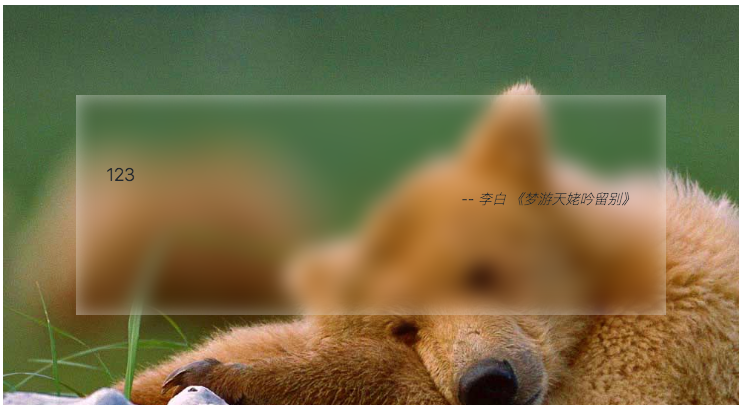
solution filter: blur(x px); 效果 .f-wrap { height: 400px; position: relative; background: url("/img/filter-glass/bg1.jpg") no-repeat 0 / 100% fixed; } .f-box-1 { position: absolute; /*left: 50%;*/ /*top: 50%;*/ /*transform: translate3d(-50%, -50%, 0);*/ left: 0; right: 0; top: 0; bottom: 0; margin: auto; z-index: 1; width: 80%; height: 55%; box-sizing: border-box; padding: 66px 30px; background-color: rgba(...

2020-03-12
css-svg实现小于12号字体
效果 .s12-wrap { display: flex; align-items: center; justify-content: center; } .s12-d { width: max-content; margin: 20px auto; } 千山鸟飞绝 - from hill to hill no bird in flight 千山鸟飞绝 - from hill to hill no bird in flight const svg = document.getElementById('size-svg'); const sText = document.getElementById('size-text'); const inp = document.getElementById('s12-inp'); let size = 12; const fontsizeHeightMap = { 1: ...

2020-03-13
css svg loading demo
本篇将记录一些 loading demo。 通过svg属性stroke-dashoffset 偏移和svg的差速旋转实现 loading 了解 stroke-dashoffsethttps://developer.mozilla.org/zh-CN/docs/Web/SVG/Attribute/stroke-dashoffset loading-1效果 .svg-loading-wrap { margin: 10px auto 10px 10px; } .svg-loading-wrap .item .load { width: 75px; animation: loading 3s linear infinite; } .svg-loading-wrap .item .load #loading-inner { stroke-dashoffset: 0; stroke-dasharray: 300; stroke-width: 10; stroke-miterlimit: 10; stroke-linecap: round; anim...

2020-03-11
底部 footer 自适应
底部 footer 自适应在底部 .btn-wrap { position: relative; width: 300px; height: 500px; overflow-y: auto; margin: 100px auto; border: 1px solid; } .btn-content-wrap { min-height: 100%; text-align: center; background-color: azure; } .btn-content { padding-bottom: 40px; } .btn-footer { margin-top: -40px; background-color: #00adb5; line-height: 40px; color: #fff; text-align: center; } .btn-s-input:checked ~ .btn-content > .btn...

2020-12-25
Css 模拟赛博朋克 故障风格 按钮
clip-path 和 step 的运用 记录。 .punk-wrap { display: flex; align-items: center; justify-content: center; width: 400px; height: 300px; margin: 100px auto; background-color: #F8F005; } .punk-btn, .punk-btn::after { position: relative; width: 150px; font-size: 25px; height: 40px; line-height: 40px; font-family: 'Bebas Neue', cursive; outline: none; border: none; ...
评论
最新文章


